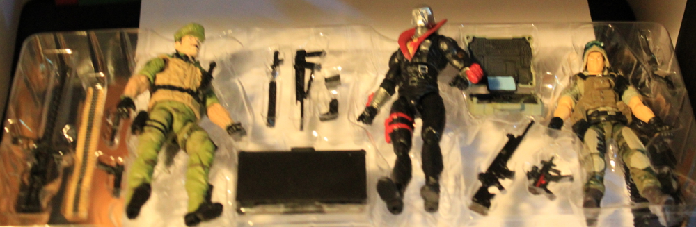
![]() Early Today I received the 50th Anniversary G.I.Joe three packs that I had pre-ordered on BBTS. I was pretty stunned at the amount of paint errors and other issues with the figs, I was prepared for the feel of more “rubbery” plastic and some errors, but I felt it was worth putting up some quick pics.
Early Today I received the 50th Anniversary G.I.Joe three packs that I had pre-ordered on BBTS. I was pretty stunned at the amount of paint errors and other issues with the figs, I was prepared for the feel of more “rubbery” plastic and some errors, but I felt it was worth putting up some quick pics.
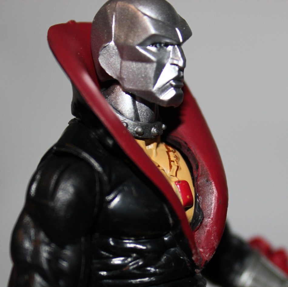
First up a preview of things to come, “melted” collar Destro.”
 Noticed that weird melted look on the bottom of the collar ? I noticed pretty quickly, before it ever got out of the package.
My experience with the product started fine.
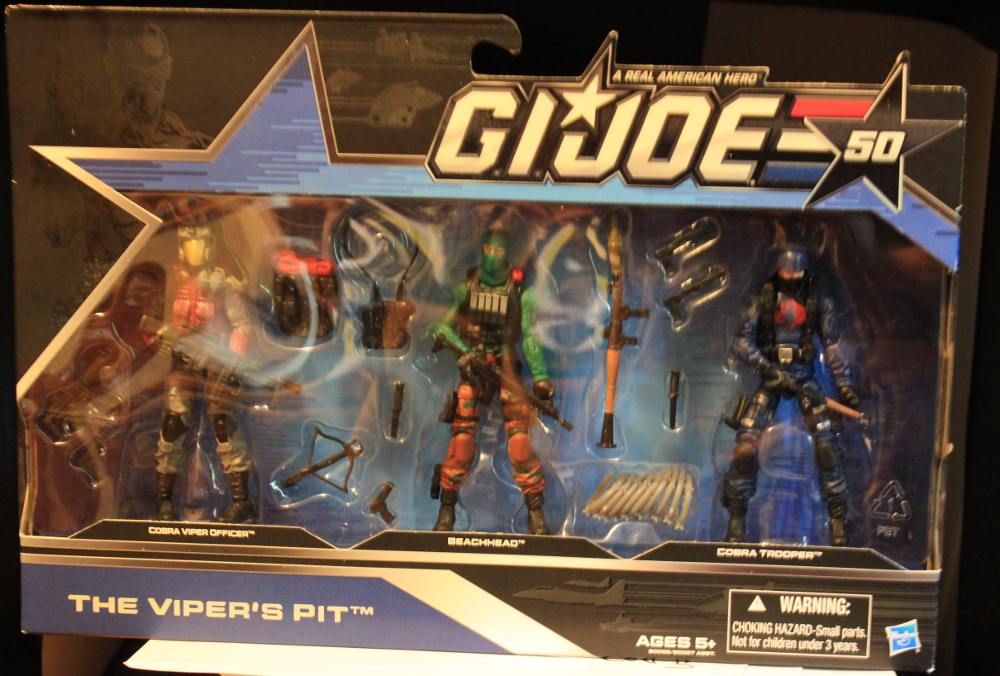
 I love the packaging design. Blue is my favorite color, and the pattern within the blue matches the classic pattern usually seen in red.
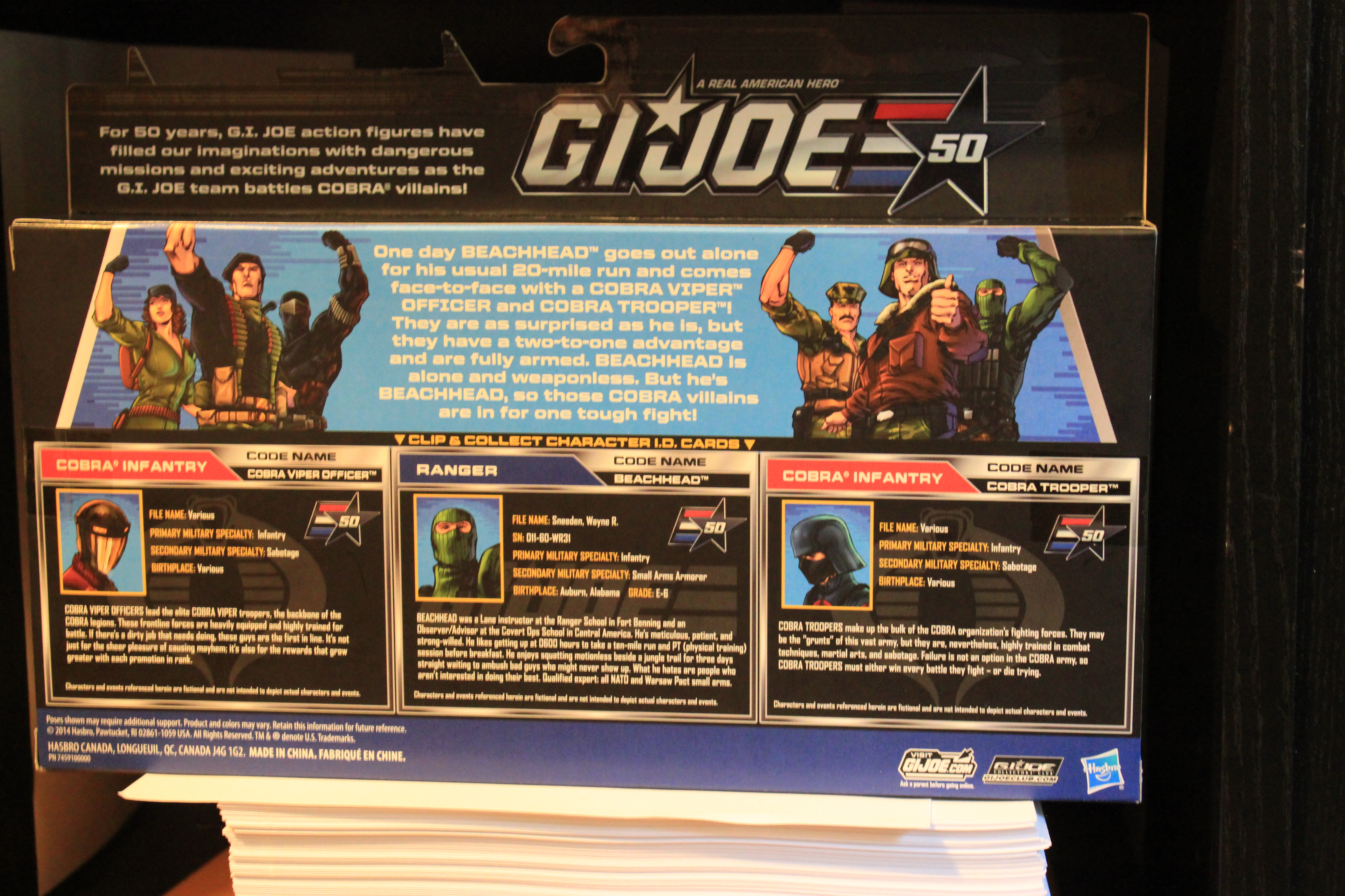
 Obviously Joe has not been battling Cobra for 50 years,that irked me a bit and made my heart go out for the 12″ fans. Aside from that the package continues to look nice on the back, and I really like the the mini-story and the return of the filecards. It is odd that they inform you that Destro has left Cobra, but put him on a cobra filecard, stand, and give him a gold cobra logo. But the product inside left me wanting more.
 Easy to open, cut the tape, lift the flap and pull out your figs.
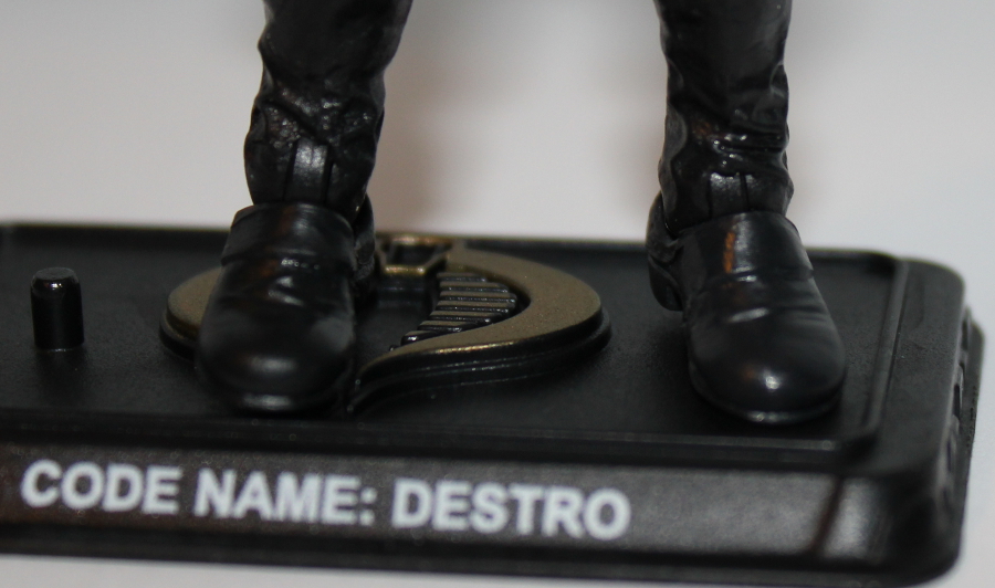
 Let’s continue examining Destro.
Besides this weird melted collar:
 Paint issues are obvious inside the color.
 I’m really bothered my the Cobra logo here. It goes against the story, and in my opinion Destro’s Characters, but for whatever reason Hasbro seems to feel that kids will get confused if not all the enemies work for the same group.
Here you can see the paint issues exist on both sides of the collar. You can also spot some molding issues with the head, seeing clear flat spots and lines.
 While move obvious in person, the left foot is clearly lighter, a really dark grey, but does not match the black of the rest of my figure.
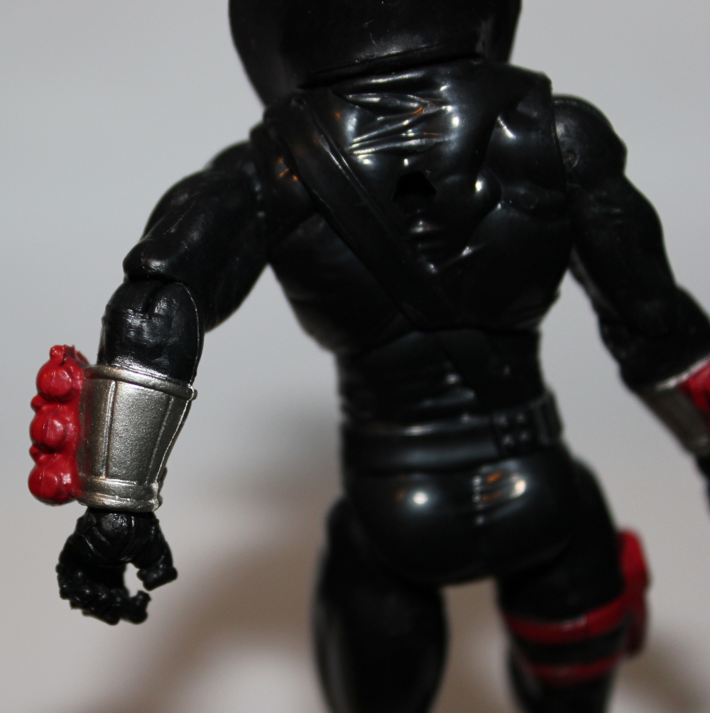 The silver paint bleeds off the arm bands as well.
The figure is by no means ruined, and I’m actually tempted to get another, mabye 2 just for the head. I need to repaint one of those babies in Gold! and need another for my mini shelf of Destro helmets. I’ll save a score for a full review I can get to one, but in short he is good, but hampered by poor quality.
Next Up Hawk
 Yeah I started with a but shot! You’ll notice a stray blob of grey paint, and that the paint on the armor and straps don’t end where they should. The different shade between the butt and the legs isn’t as obvious in person, and is something that has happened with Hasbro figs in the past.
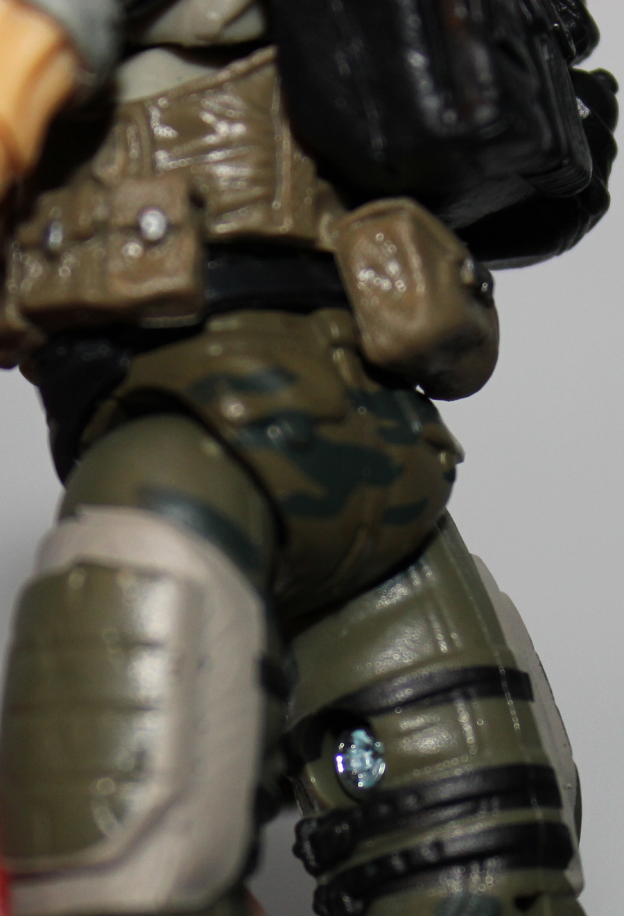
Both sides of the leg armor and straps are effected, and in my opinion more than on a figure that would have been produced in the past.
 The neck has a large glaring lack of paint, but given the same necks that shouldn’t have gone unpainted to save cash it may not be the end of the world.
The shoulder as a lack of paint apps near the joint and the Gold Star is smeared. I don’t like the Star, In theory I like the small change to make it different enough to tell apart, but still a suitable replacement for those who never found a POC Hawk, but I wish they wouldn’t have went in a different direction. Joe has really needed a solid logo for it’s team for a long while, the Gold draws to much attention and the artsy styled star contrasts too much with the more serious gear.
Next Up Leatherneck:
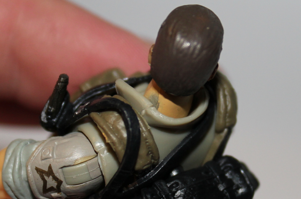
 Look at that unpainted chunk of hair!
Is that supposed to be an American flag? it’s just a bunch of lines.
some straps painted, some not 😦
Silver bleed on the wrists cuffs (which would have been fine in less eye drawing black but cover the wrist articulation very well)
The biggy though? That skin paint! it looks like it is spray painted unevenly. It will stick out on a shelf.
and if you look closer you can see some more issues, the mustache paint, the incredibly obvious vest differences etc.
 More hair paint issues, as you can see it is missing in several places.
  It looks really bad.
  More bad skin, get this Marine to a Dermatologist !
On a side issue, I understand that non sleeved boots = complete embarrassment for a Marine. I no limited parts were available, but it’s a negative point, and to be honest I never liked those legs for that reason anyway! (sorry if that call was made back in the day and was yours Boss Fight Guys, y’know I love you!, it’s a style preference )
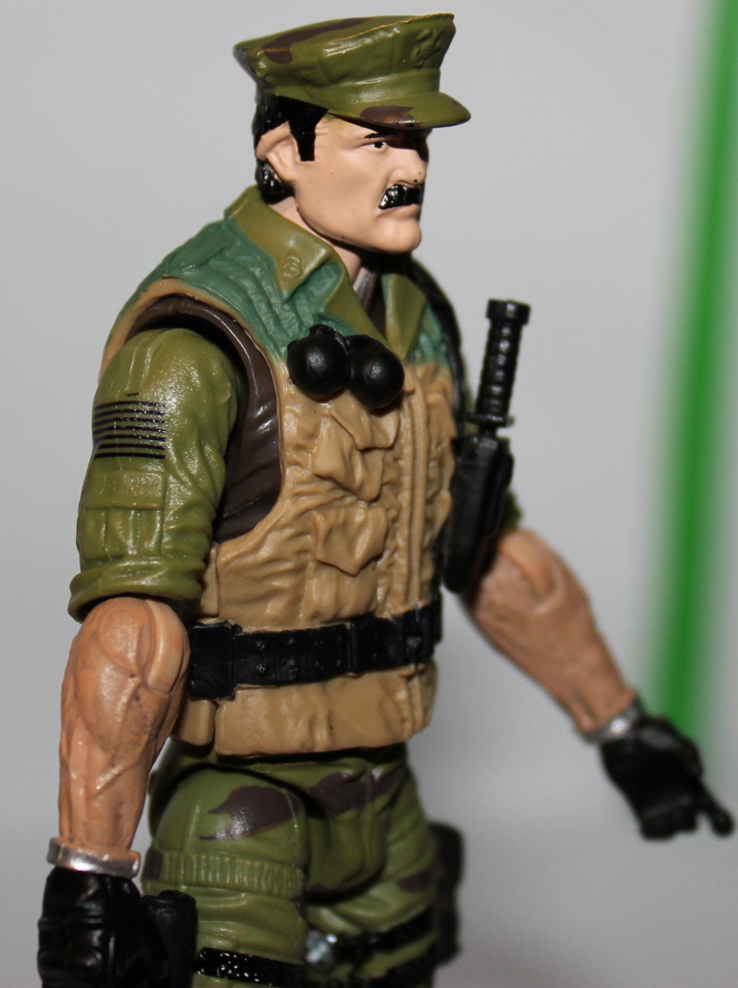
Next up 3 pack number 2
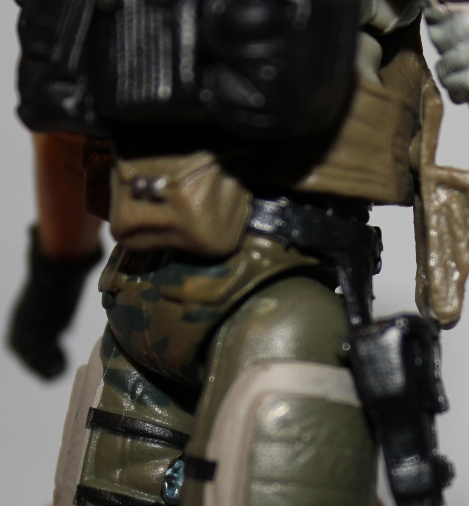
 Beachead’s belt it is gone, and the figure feels off for missing it but most the 3 pack fairs so much better than the other one.
There is some flash (is that the right term?) of extra material in the right of the Cobra Trooper and the Cobra Viper Officer has his helmet glued on, and slightly crooked. I never owned any POC vipers (I don’t like Goggles on my vipers, I know weird, I made my own, different conversation for later) I have no idea if that was norm.
My pics of the Troopers arm didn’t come out well, the rest isn’t as major.
It seems worthless to have added the dark grey on the pockets to the Cobra Viper Officer. Beachead’s knee pads seem really need to be Black.
It’s clear the weapons are rubbery and warped, but I wasn’t surprised.
I was a bit surprised at some of the issues. I’ll enjoy them , but in a diminished capacity. The choices are still odd to me, I don’t understand adding Gold to the figs or the stands, as it makes them stand out in a negative way, and the accessories seem like overkill for what we need, if the money could have gone to other things (like quality control)
Enjoy some poorly photoshopped Images of the 50th logo Below. -Sam

(psst… we are going to have some Joe Voice actors on the podcast soon, stay tuned )
