 We are only a week away from New York Toy Fair, where most expect a full reveal of the upcoming 6″ G.I.Joe Classified line. The designs, the sculpts, the packaging, all of it is already in the bag. That’s how toys are made, it’s a year or longer process. Even though we are still waiting to get our first look at them, most of the early product is locked down. I expect they have learned some valuable lessons from their own work along the way, as well as from other toylines. Because I want this line to go on beyond the initial waves, I wanted to do a few posts pointing out specific things that the upcoming G.I.Joe line could learn from, and I want to start with everyone’s least favorite game, and bizarre action figure hit:

Before I do let me clear up a rumor:
ONLY ONE ANONYMOUS SOURCE SAYS THAT JAZWARES IS MAKING JOE FIGURES, THAT DOESN’T MAKE SENSE, as John Reale was in charge of the line until he left Hasbro a few weeks ago, and now Roni Noyma has been announced as in charge of marketing. This isn’t about what Jazwares can do, this about what Hasbro can learn from jazwares… anyways…
I was introduced to Fortnite when My son wanted me to play the game with him, I tried, and it was TERRIBLE. I played some Call of Duty in my time and enjoyed it, but the fortnite maps were overly large and sparsley populated with other players, and the players I did encounter in fortnite where cheap, and overpowered. I’m too old for the micotransactions not to feel like pay to win, even if they aren’t, but that was the impression I got. It felt like it had a hard barrier of entry.
I thought I was uninterested , despite noticing some cool designs, but then came the toys from both Jazwares and McFarlane. I already appreciated the obvious homages in aesthetics in their designs , but seeing them in plastic was like a breath of fresh air. It hit all the right nostalgia points, yet was varied, drawing from multiple sources, many where bright and eye catching, and they had no attached story. I felt like could grab them, plug them into one of my shelves and imagine.
So what could G.I.Joe Classified learn from Fortnite? Let’s start with Mcfarlane’s Red Strike…

- Hidden mid torso articulation for Ninjas
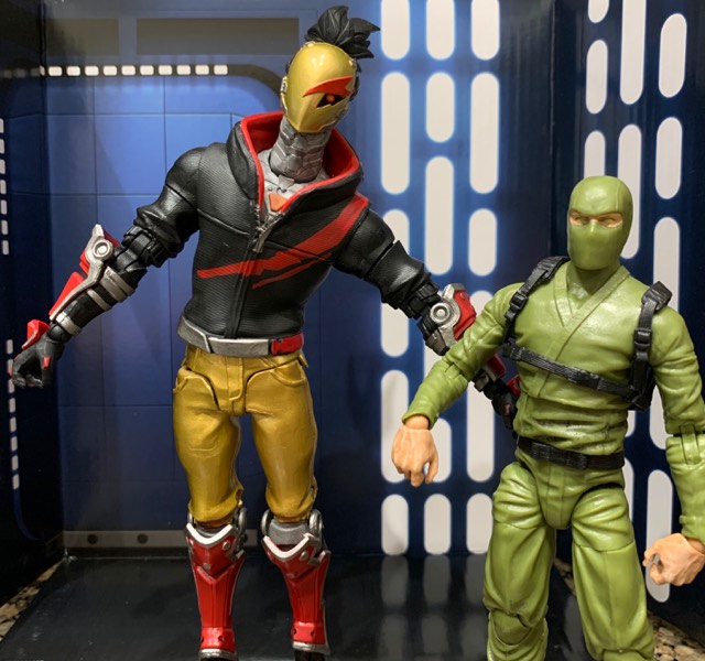
On the left you can spot Red Strike. I would have bent him over further, but he would have fallen, and on the right the excellent Fwoosh articulated icons green ninja, and future base for a Kamakura custom.
It may not be obvious, but that jacket that covers Red Strike’s torso, is super soft and flexible, meaning he has a good range of motion, but the sculpt isn’t broken up. I love the Articulated Icons ninja body, even if they are a little more true 6″ scale than my Marvel legends figures. There is an obvious flaw they have, that I admit would be hard to avoid. They did what most companies do, natural movement is in the middle of the torso, which means a break, but that hard break doesn’t always work well with the sculpt, especially a ninja gi.
Stormshadow isn’t in wave 1, but you know he is coming, how can Hasbro set themselves above Fwoosh’s excellent work when many of us already have made Stormshadow customs? Cloth is one way to go, but doesn’t mesh as well with the rest of the plastic, I think they should adopt the soft plastic approach Red Strike has here. We could have all the detail of the gi, and the articulation, without the break up.
2. Go wide
For the U.K. fans of G.I.Joe, or Action Force, they likly thought Mcfarlane’s Hybrid looked familiar:

This scaly lizard beast with hints of red and black seems to be inspired by Action Force’s Kraken. While like the Firefly/Havoc Connection it’s not the most unique design, it feels more distinct than just a soldier in urban camo.

(Photo from figurerealm.com)
One of the reasons Fortnight is a hit across both kids and adult collectors is that it is pulling from a wide variety of inspirations. The figures on a shelf each stand out.

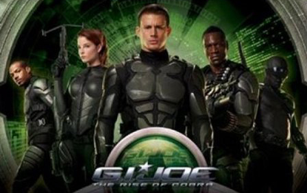
One of the worst aspects of the G.I.Joe rise of Cobra movie line was that it was just a bunch of dudes in black armor. Nobody stuck out. The iconic colors where gone. Later figures like Helix from the video game, or non movie characters helped, but the initial waves failed to stick out in the toy aisle. Many collectors think we want realistic, and even all black or all camo, and while many of us do enjoy those things, but if a new toy doesn’t add something to the display shelf it can get left behind on the pegs.
Time is limited, we only have a few waves before it will be time to Push the Snake-Eyes movie, but G.I.Joe has a rich history. If they want to learn from Fortnite, they can include pieces from all throughout Joe’s life, from Adventure Team, to Renegade’s Bio Vipers to Zombie Vipers, all in the right dashes of variety to keep it feeling fresh. Overdoing it will turn the more military minded collectors away.
3. Neck articulation:
Remember Red Strike above?
He features neck articulation like on Mafex and S.H. figuarts, that really helps make the figure expressive, even with a mask. It also mirrors the a Real American Hero era with it’s cut at the bottom of the neck line. Why not up the ante compared to marvel legends? Joe was always ahead of the game in articulation, why not give us something similar here with double ball pegged necks for excellent emotional poses.
4. Mcfarlane and Jazwares prove you can go two directions with designs.
Jazwares stays true to the softness and cartoony style of fortnite, while Mcfarlane leans towards realistic, while still being true to the heart of those designs. If Hasbro dips into the more stylized designs like Renegades, or the overly bright designs of the “neon nineties” Mcfarlane has proven they can give a nod , and be recognized as what they are, while still adding an edge to it, making it more palatable for adults.
5. Not all articulation is created equal.
I want to turn to Jazwares for a moment, because I love their 6″ line too. In fact I like it’s scale better for humans in the line, even if it is a bit shorter than my preferred Marvel Legends. But they do have gripping articulation, can we leave that one behind? It works better than on old Toy Biz legends, but it doesn’t feel needed. Toe joints aren’t really for me either, but I can live with or without them. Jazwares really does do something else I want Joe to learn from…
6. Go wild with the accessories:

If this fish monster gets Popcorn, why can’t we get Yo Joe cola?
There are lots of great Joe Facebook Groups out there, but If you want to keep talking about it at a place dedicated to the new scale, you’re more than welcome @ https://www.facebook.com/groups/gijoe6inch/
The one Joe group where no one should be yelling at you that they won’t buy 6″ and only want classic 0-rings. Unfortunately too often in other groups it turns into a negativity fest 😦


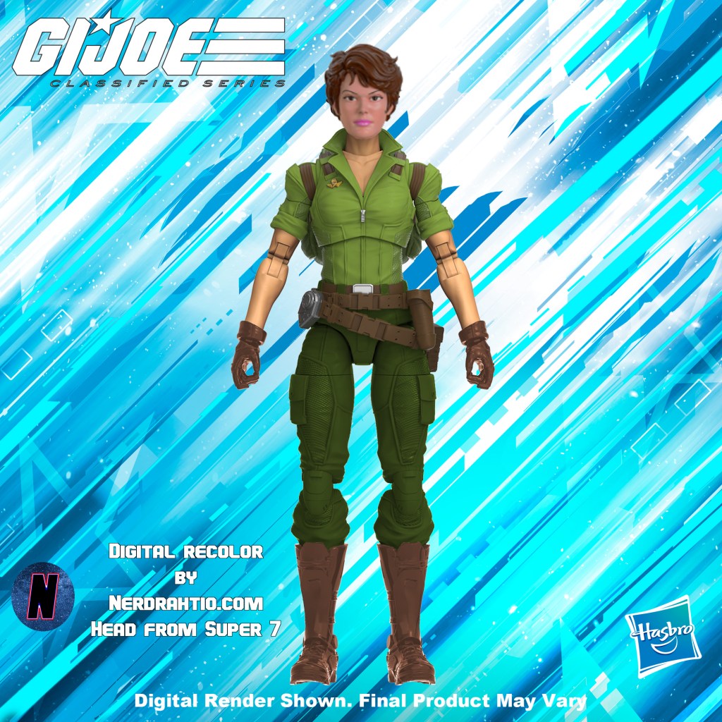


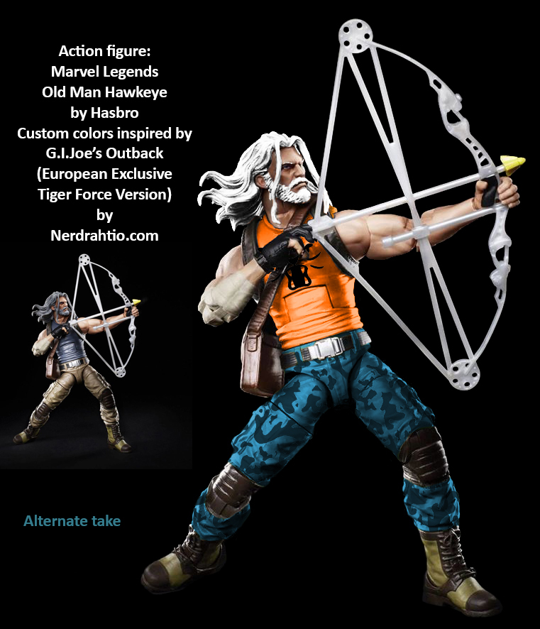

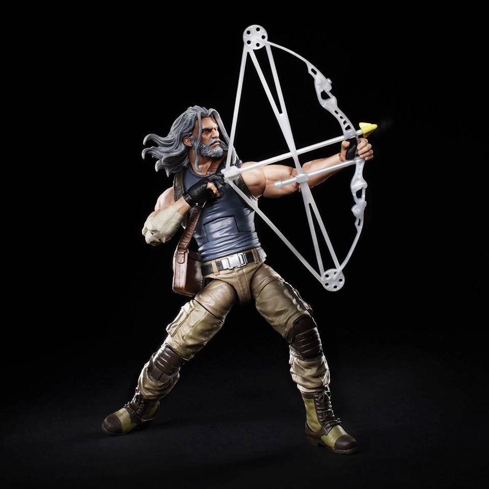

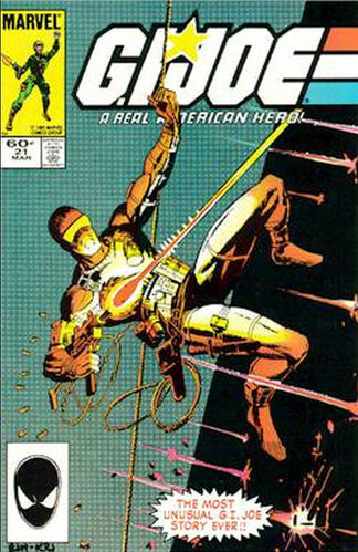
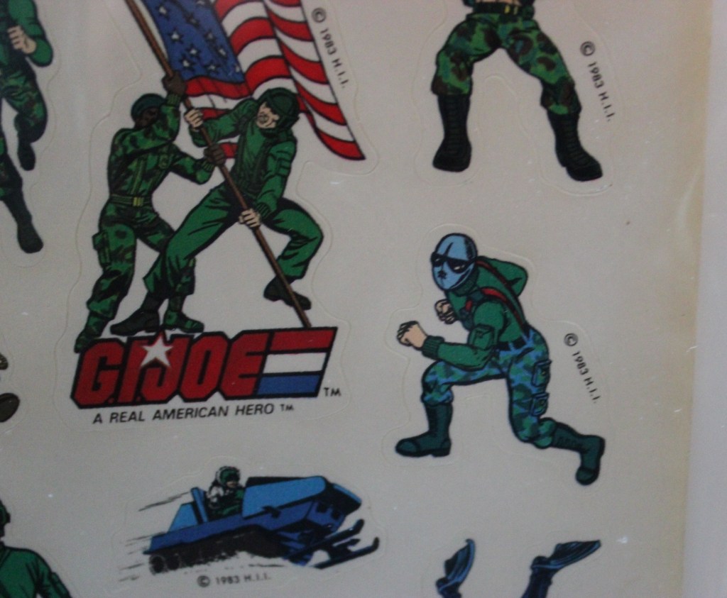

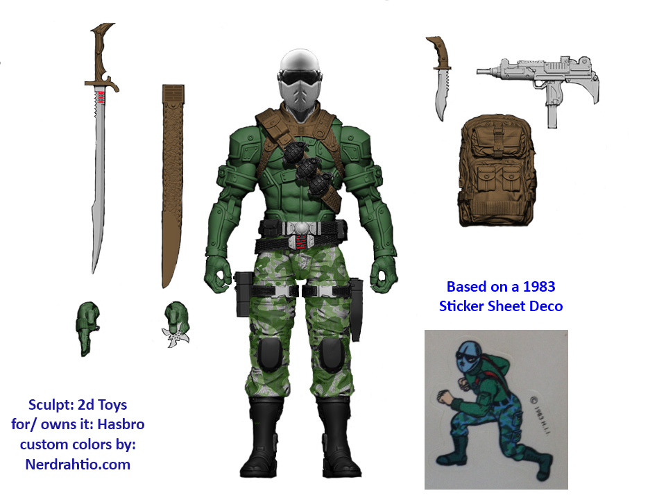
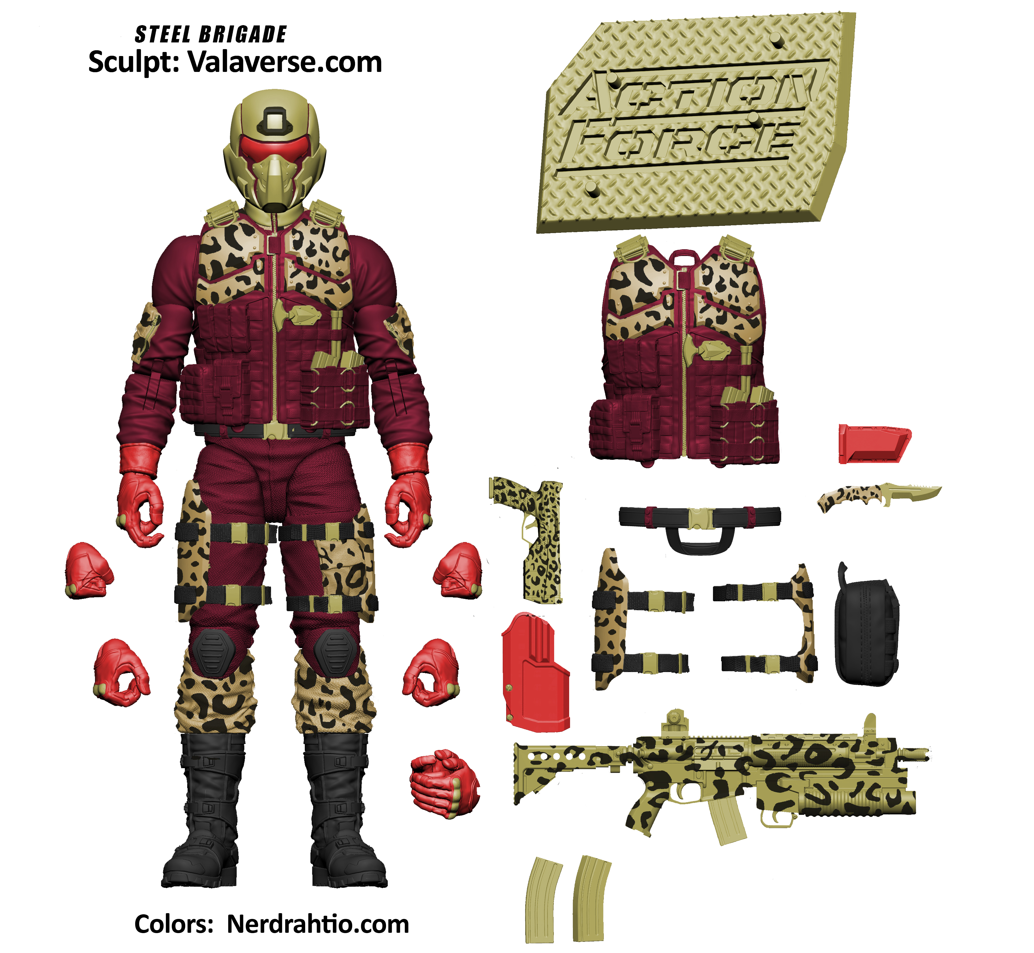
 Bobby Vala fom Valaverse.com gave me a better starting image for my digital recolors of his action force lines, and I after having just completed a Destro in “pimp daddy” style, (


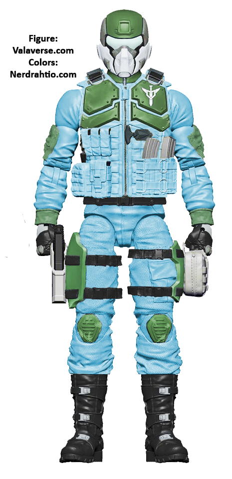
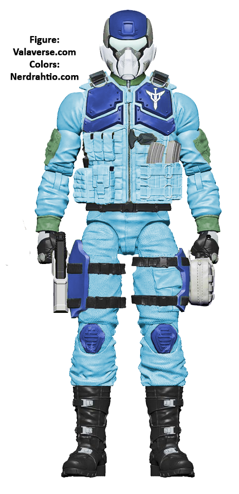
 Many folks have complained about the brighter elements on the Classified series Duke, so I did a little digital recolor when I made the new banner for the

 some wip in shots:

 We are only a week away from New York Toy Fair, where most expect a full reveal of the upcoming 6″ G.I.Joe Classified line. The designs, the sculpts, the packaging, all of it is already in the bag. That’s how toys are made, it’s a year or longer process. Even though we are still waiting to get our first look at them, most of the early product is locked down. I expect they have learned some valuable lessons from their own work along the way, as well as from other toylines. Because I want this line to go on beyond the initial waves, I wanted to do a few posts pointing out specific things that the upcoming G.I.Joe line could learn from, and I want to start with everyone’s least favorite game, and bizarre action figure hit:
