I’ve always wanted some more TF X Joe crossover toys, but now that Joe has moved to the 6″ scale, I wasn’t happy to see a refocus on O-rings. Even when I was collecting 1:18th, I preferred the latest articulation and sculpting detail.
I decided to whip this up as a fun alternative take based on the existing molds. I shared this on fb earlier in the year, but am just now getting to do it here.
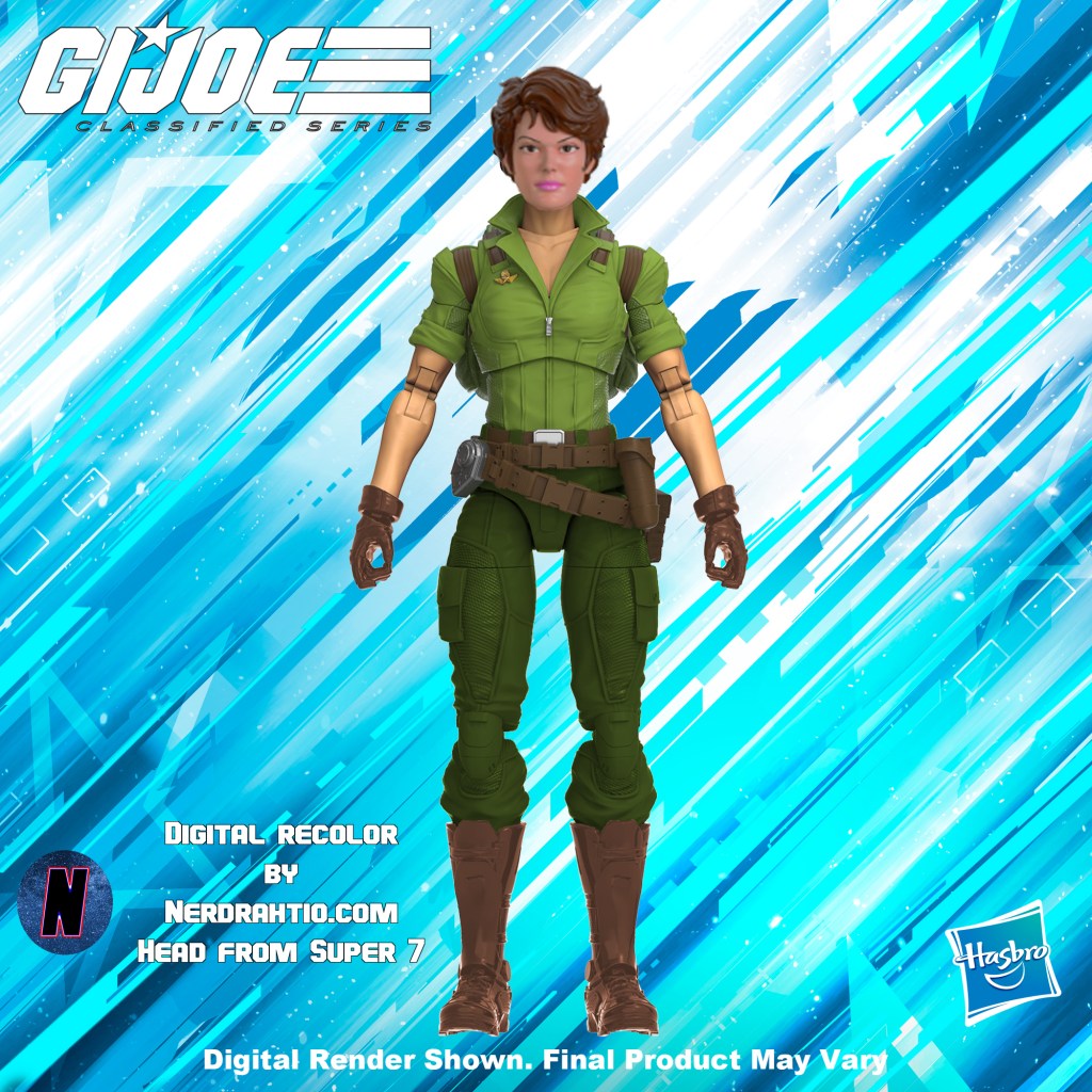
I understand that there are budgetary limits for a lower run exclusive item, that the new art and card add to the cost, so maybe I can understand the lack of a new headsculpt, but the retro Lady Jaye we are getting, is simply too close to the declassified version to me.
It’s fair to suggest that that the retro carded version should match the toy, not the toon, but that’s where I think the Classified team should have preplanned this as an option and had this release as the original.
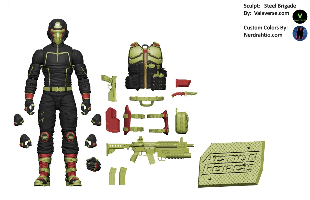
This one began as another parody, but I ended up really enjoying it, so I only added one element of parody on the unarmored torso. I wasn’t a fan of over the print on the “Snake Supreme” Cobra Commander, nor am I really a fan of that mold, it feels over busy with details that aren’t functional. When I applied extra deco to the Steel Brigade model, it became obvious that every bit of detail was functional, and I think that really separates the Action Force aesthetic from the new Classifed Joe line. Both are highly detailed, but Action Force, uses those details for a purpose.
Here is next to his inpiration. You can see the overlay is just “overdesigned” written a bunch of times. I don’t think CC would wear a shirt like an proffesional bowler from the 70’s.
At one point I intended to make his color red, and maybe his pockets too, and one of the belt buckles. I forgot about that at some point. I may be do some more touch ups and do an additional upload later. As I completed it, I began to think of it more as an Iron Grenadier than CC, and that influenced where I stopped.
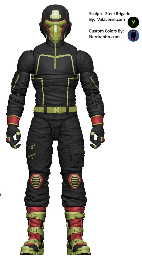
Here he is without the overlay, because I liked it enough to go forward with the parody elements.
and with the armor on
You will notice I colored the tongue of his boot this time, something I haven’t done before.
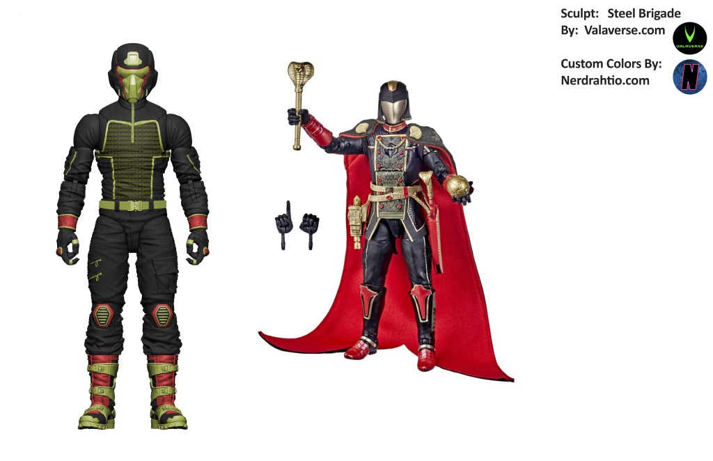
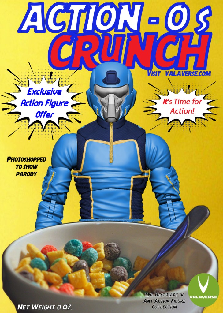
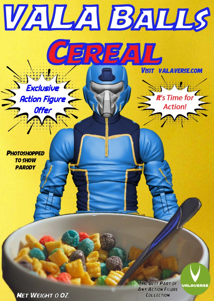
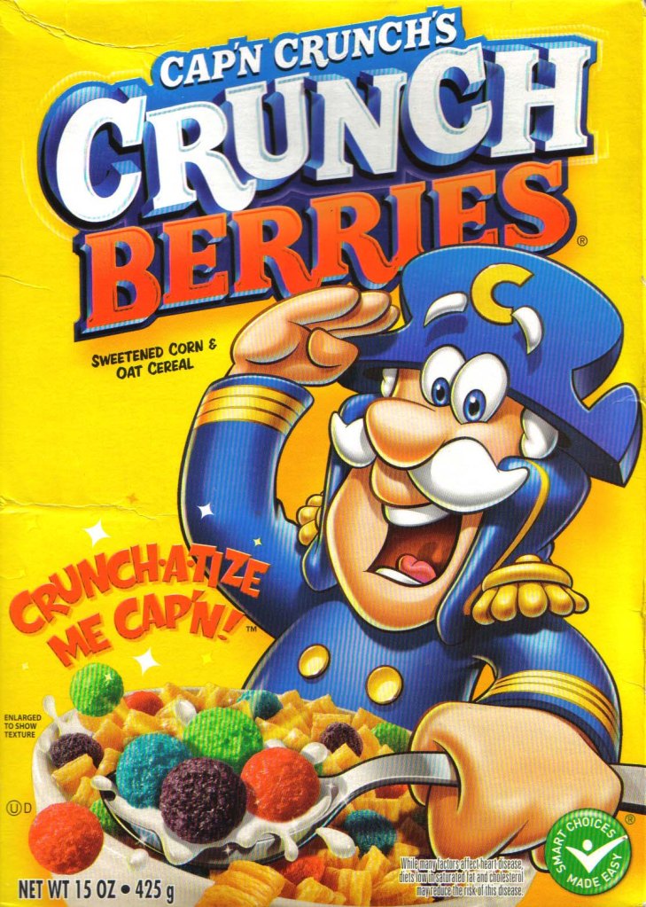
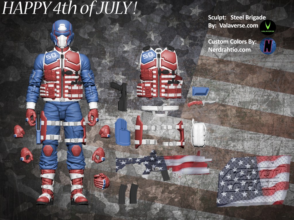
It’s been a few months now, but remember that NTWRK disaster? Lots of folks noticed that that someone who was Commanding Cobras, looked more like Capt. Crunch than his old self. Why should the classified line get all the cereal fun? Today’s Photoshop is based on an idea by Bobby Vala, of Valaverse.com. I gave the Steel Brigade a parody treatment in light of regal Cobra Commander’s similarities to Capt. Crunch.
and of course the armored look
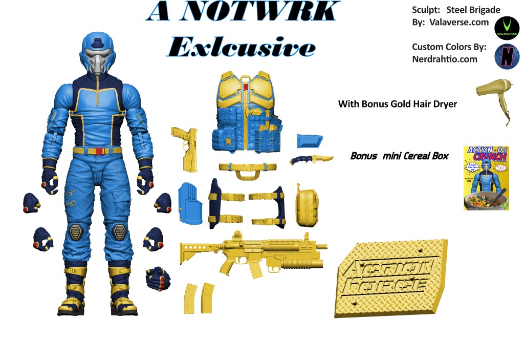
You will notice I have added several new deco bits that I don’t normally included. I’ve also taken the time to do add more layers in my base photoshop image, so I should be able to make these recolors a little faster.
Some close ups:
Here is an alternate take on the Cereal box:
both were based on this Capt. Crunch box
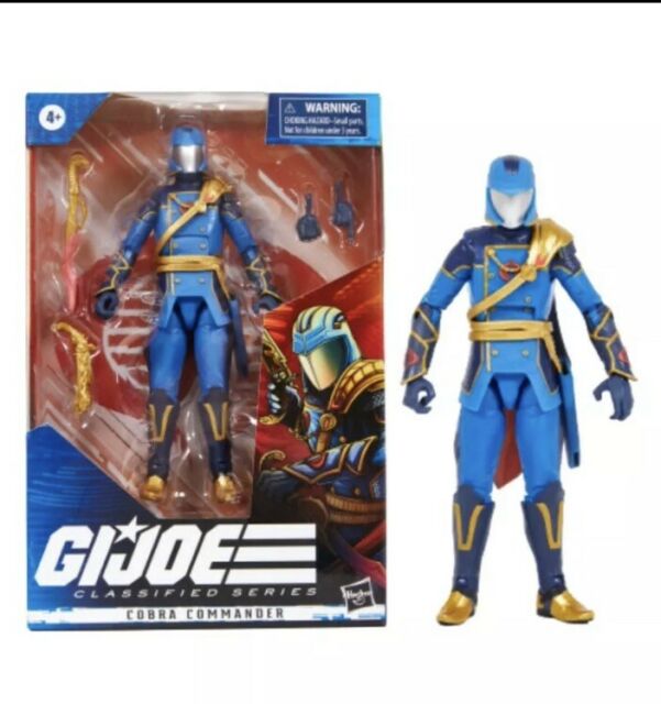
and if you haven’t seen the “regal CC” here he is:
This was a fun one to create, check back very soon for another one I already have done.
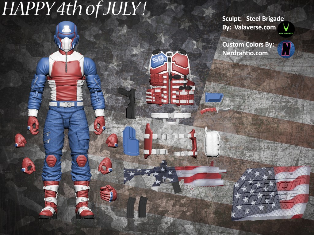
I hope everyone has a happy 4th of July! In celebration of the holiday, and the freedoms recognized by the U.S.’s founding father’s I gave Steel Brigade a patriotic makeover!
Remember you can still pre-order Steelbrigade Via Crowdox or BBTS. You can also learn more about Valaverse’s Action Force @ Valaverse.com and join the official home of discussion for Action Force @ Legions of Valave on Facebook.
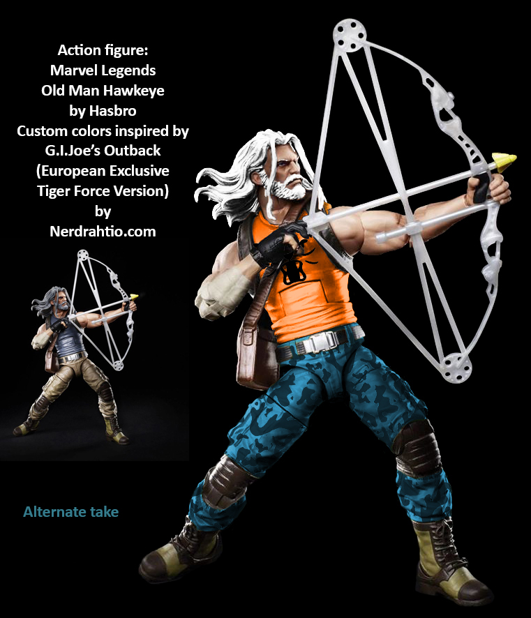
While I typically prefer more realistic looks for the Joes themselves (not so much for Cobra) sometimes something crazy a line and becomes a different kind of cool. Outback is the best example of that. The European exclusive Tiger Force Outback, with his bright orange shirt, looks like old man Chuck Norris on Steroids.
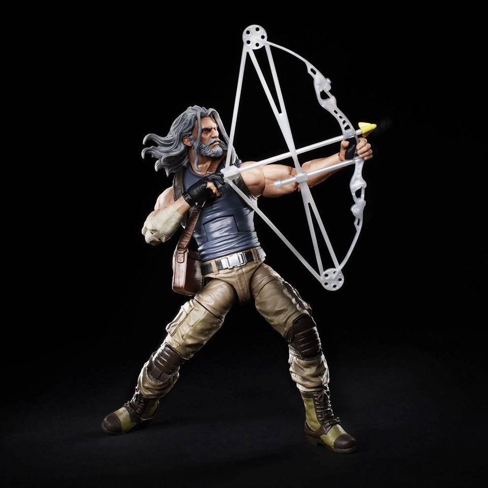
After I did the regular outback look from the upcoming Marvel Legends old man Hawkeye, (Which you can see here) I had to go and do the Tiger Force version! 2 in fact!
The actual European tiger force version had brown camo, but that didn’t look right for some reason, neither did the gray boots, but that got me thinking and a great contrasting color to orange came to mind. I also used a blue camo head band when I cosplayed at Tiger Force Outback at a Joe con.
Next up I’ll be heading back to the world of Valaverse for another Steel Brigade recolor.
This one is simple. The moment I saw the upcoming Marvel Legends old man Hawkeye from the Old Man Logan story, I thought it was obvious he looked like a great base for Outback.
So here he is, and the original image I used after him.
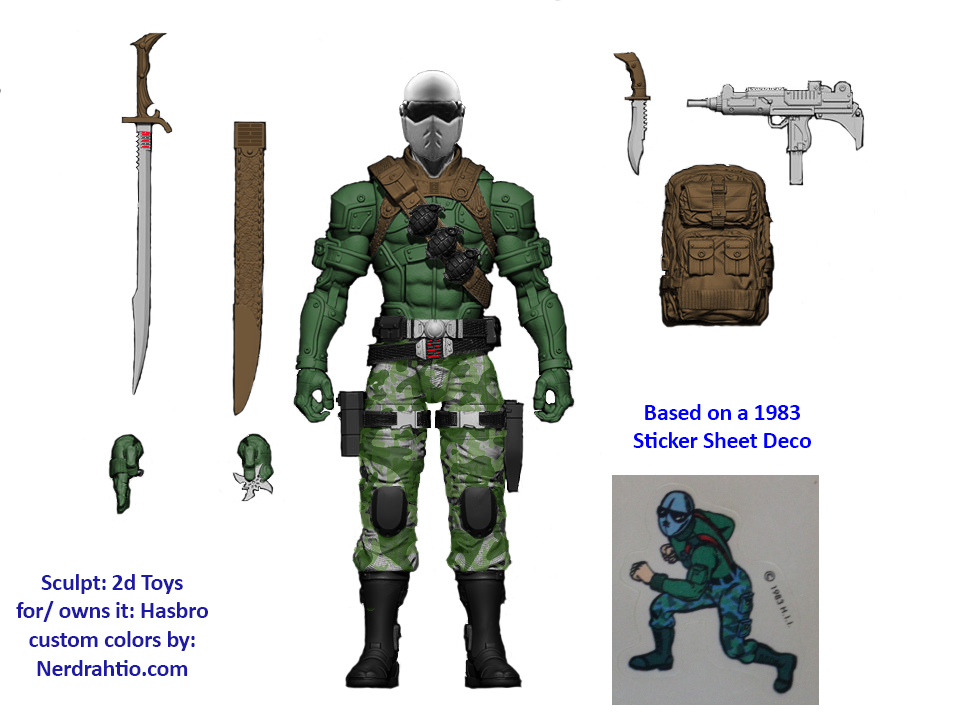
G.I.Joe’s Snake-Eyes hit the pegs in 1982. While the rest of the Joes, save Scarlet, were sporting some Olive Drab, Snake-Eyes wasn’t sporting deco at all. The mute, with the muted colors, sparked young imaginations both because of his fascinating file card that would go on to play out in comics, and his physical form which stuck out both among the Joes, and most typical good guys.
Snake-Eyes would undergo a lot of changes and interpretations over the years, and even rather quickly as the line grow. Before his famous knight visor v2 look, Sunbow turned him blueish purple.
The comics turned him into a ninja. In one particular famous story, “The Silent Interlude” it wasn’t just SE that was mute, but the entire issue was without word bubbles. That wasn’t the intent however, it was due to a lack of time to get the issue to press.
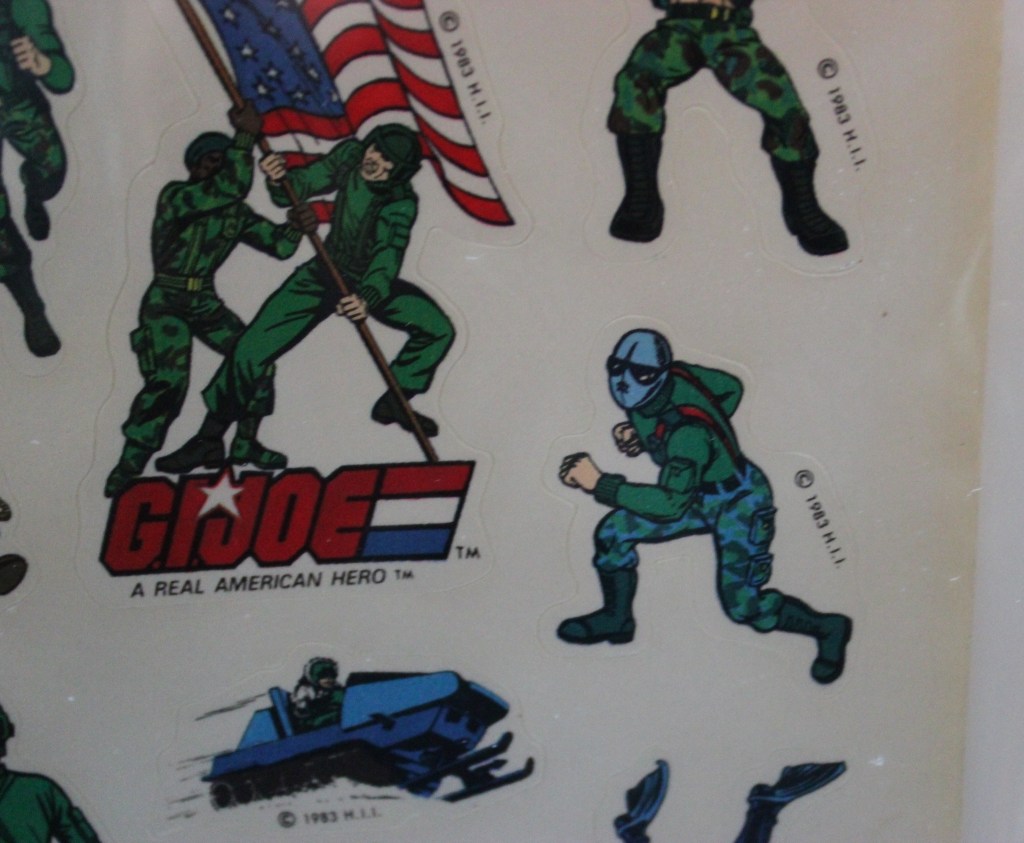
I entered into the online hobby around the year 2000, and there was a rumor that Snake-Eyes himself was impacted by a similar issue, but rather than time, it was cost. Numerous online users said, the real story with SE, was simply that they cut his deco to cut cost. As evidence the pointed to a 1983 sticker sheet. After hearing from the late G.I.Joe Historian Gary Goggles that originally many of the 013 (original 13 Joes) were going to be more unique, I had to track down a copy of that sticker sheet myself.
Looking at the sticker sheet we can see that the Polar Battle Bear was blue instead of white. So that might explain the blue/gray on Snake-Eyes. It’s worth noting he has bare hands, just like the cartoon. His shirt and harness was much more in line with the rest of the Joes.
I was so enamored with the design, that among my first ever digital recolors was The Loyal Subjects version of this design:
I wasn’t the only one. Matthew created a fairly famous custom based on the image named Mayor. You can check him out here. Matthew, and his twin brother Chad are among the rare Joe fans I have met in person outside of cons, and are pillars of the joecustoms community.
We do know that some 013 were intended to have some differences. Including some having unique heads. Although I need to find a new audio host, you can still see the images from our interview about “Baby Face” Breaker with my friend Jonathan Robinson here.
But what about SE? I’m aware what the high profile toy documentary “The Toys That Made Us” has said, but long before they were a thing, I went straight to the source and I asked Kirk Bozigian. His answer? SE was always supposed to be inspired by the S.A.S. and in black. The color scheme from the sticker was likely just used to brighten him up. You know how hard it is to make an all black sticker look cool? to children? The clad in all black anti-hero wasn’t nearly as popular of a trope yet, and certainly not on Saturday morning cartoon.
I looked at some of my Joe related notes, and past Pms, with Kirk, and couldn’t find when/where he confirmed this. It may have been in person, I’ll presure that further. That said, Even if it wasn’t his original intended look, I still love it.
With the background info out of the way, based on that little sticker in 1983, I took Fred Azcon’s Digital sculpt for the G.I.Joe Classified line, as well as a commando style head from the Pursuit of Cobra Line, and gave him the sticker sheet treatment.
I chose to leave the blue/gray simply grey, and to keep the gloves. I used this as an excuse to keep the Uzi gray, as I regularly had light grey weapons in my Joes hands as a kid, I don’t even know where I got them. I also accidentatly stumbled on the light brown w/ dark brown Arashikage logo combination and fell in love with it. The vest in brown, reminds me of Stormshadow’s DDP Solo Series look in a weird way, which might give me a future idea since I’m playing with adding new head sculpts to these.
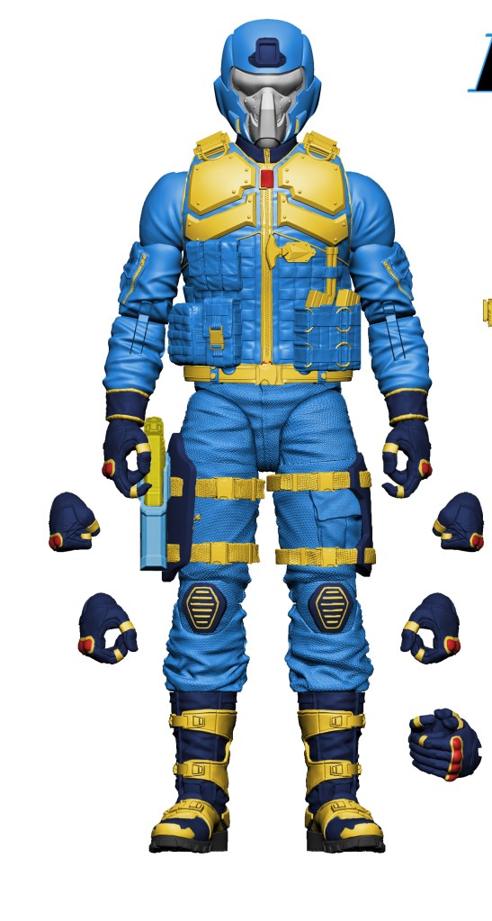
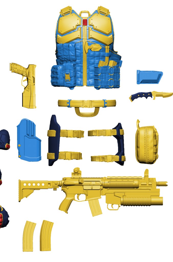
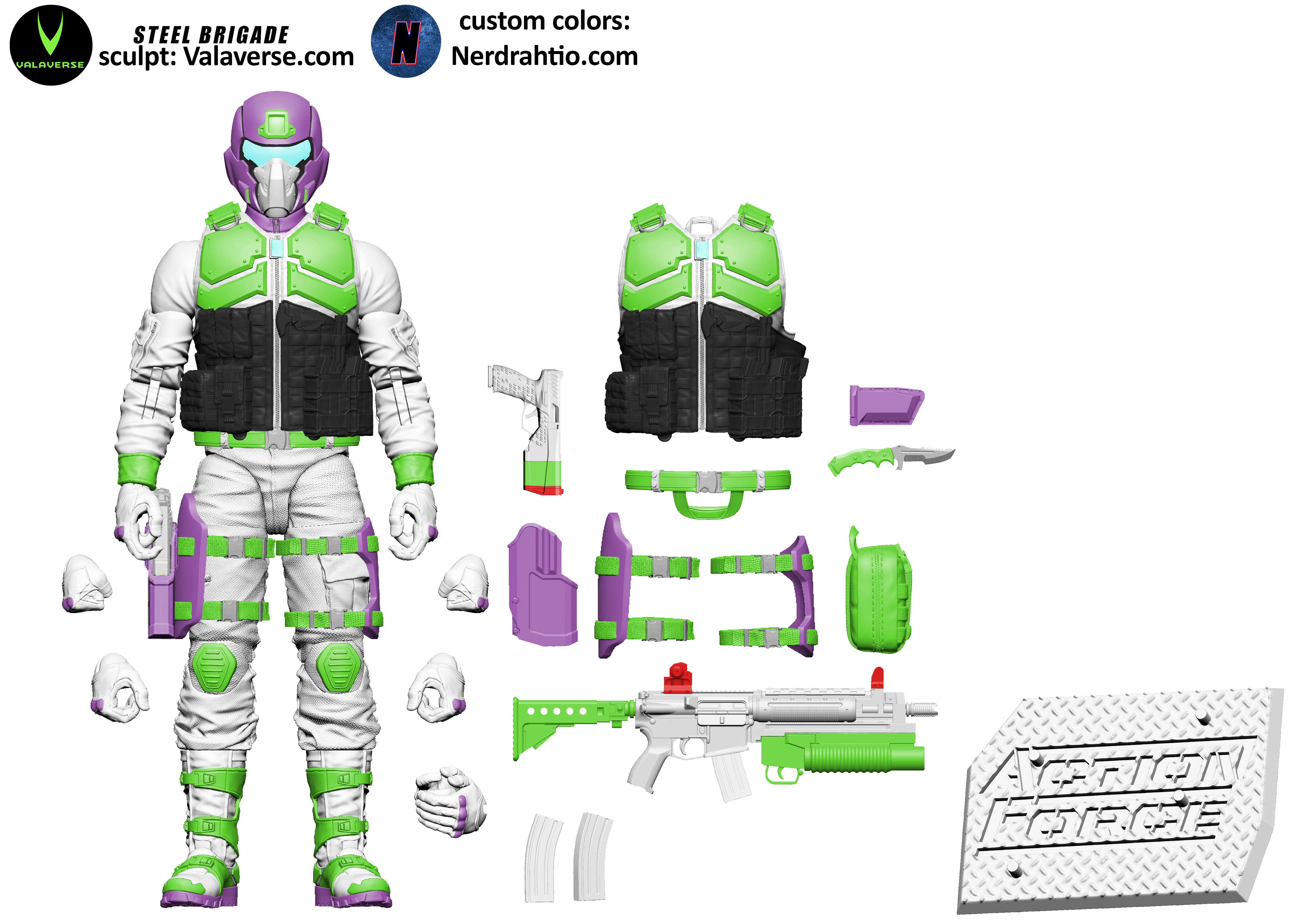
I really enjoy making these. Bobby Vala and the sculptor’s he hired really made a wonderful template in the Steel Brigade model. This time I went with what I call the Infinaught (get it, infinity, naught as in astronaut , but also naught as in not.)
Thanks to Bobby Vala I have much higher res versions to work with, but I noticed it didn’t have a pistol and holster from the front view, so this time I pulled it from the standard images to put on on int he full geared up mode.
The light blue strap in the middle of chest armor is meant to mirror Buzz Lightyear’s Star Command logo. It’s a clear homage, but with differences in the helmet, and sculpt, I think it’s distinctive enough that if Bobby were to do something like this, it wouldn’t be an issue with Disney, hence I left out buttons and the lightyear name badge and star command logos. To be clear, I’m just doing these for fun, but I wanted it to be believable/doable and Bobby has 100% permission to reuse any of my recolors in anyway he wants if he wants. Me ? I’m just day dreaming, and hoping to inspire some physical customs and more sales.
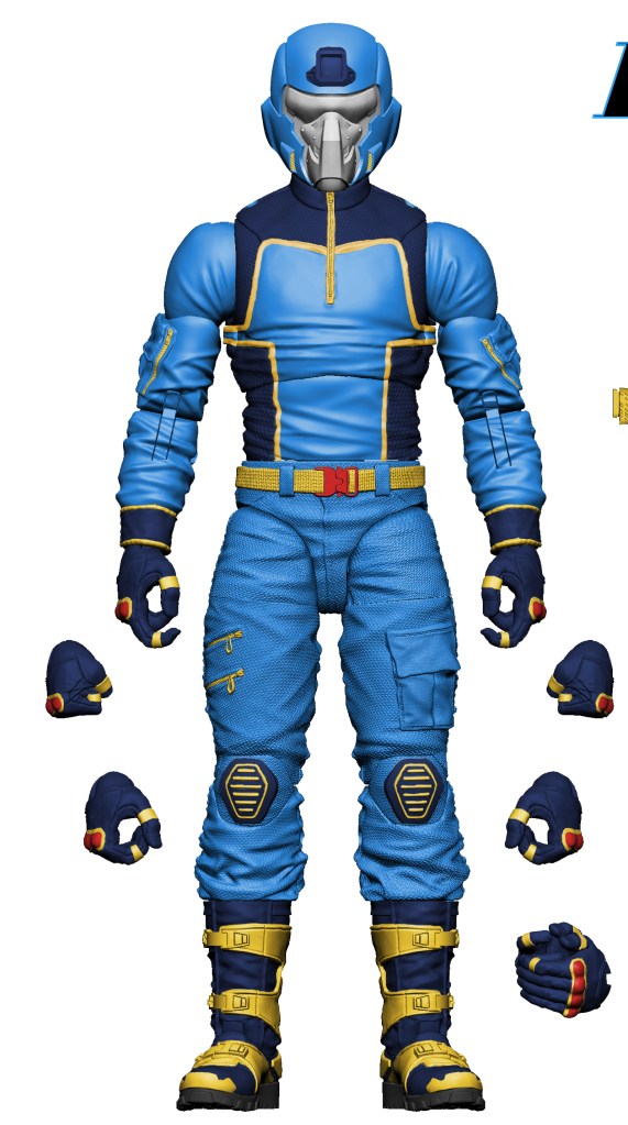
Here is with his gear off:
I have to think our FB’s page resident crap poster and my go to fb group admin Jonsey for helping me make some color choices on where to place the red on the weapons, and his visor color.
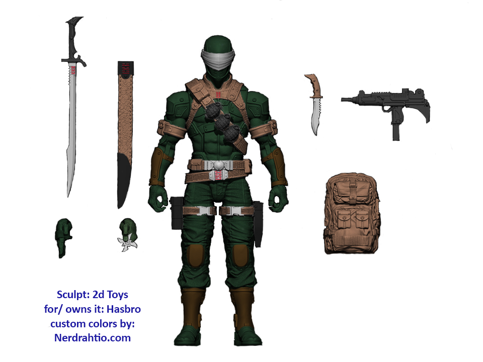
Long time Joe fan Dacre Bush noticed something interesting about the art first used as a poster at New York Toy Fair, and now used on the back of the G.I.Joe Classified series packaging. Take a look at Snake-Eyes, notice anything different about him?
The art did change from the original poster to the packaging backing, but only slightly. Gung-Ho seems to have lost his undershirt, and many fans rejoiced about that. Neither SE seems to show a red dot like the wave 1 figure will above his visor, but interestingly it appears that this SE, is actually dark green with black camo. The head appears black still, but the body definitely seems to be a different shade. I’ll admit it may be just a trick of how the image was captured, but it peaked Dacre’s curiosity, and mine too.
I recreated it below, but didn’t stick with being too close to how the image appeared. I included the head, and it felt wrong not add some brown on the arm guards, knee pads, and shin guards to help show the different detail in the armored bits. Nunchuck, Hit n Run and some Sigma Six designs where in my head while I was at work.
here he is without camo:
To do the coloring, I used the image 2dtoys released here: I’d recommend giving him a follow, and I really enjoy his work.
You might notice I intentionally altered a couple of things, removing some cracks in the armor and the Arashakage logo on the webgear doesn’t have a box around it clearly anymore, as it wasn’t sculpted and I had to copy and paste a shrunken version from the scabbard.
I had intended on doing a sticker sheet version of SE next, and he is still soon up, and I know have this SE with the background removed, but I think I”ll continue to switch between Joe and Action Force, so another Steel Brigade is likely next.


 Long time Joe fan Dacre Bush noticed something interesting about the art first used as a poster at New York Toy Fair, and now used on the back of the G.I.Joe Classified series packaging. Take a look at Snake-Eyes, notice anything different about him?